
Introduction to Web Design Output Device
- Types of Length Measurement
- unit of measurement
- Percentage of the size of the containing element
- keyword description
- Keyword expressing the size relative to the size of the containing element
Example of 2010 Screen Resolutions
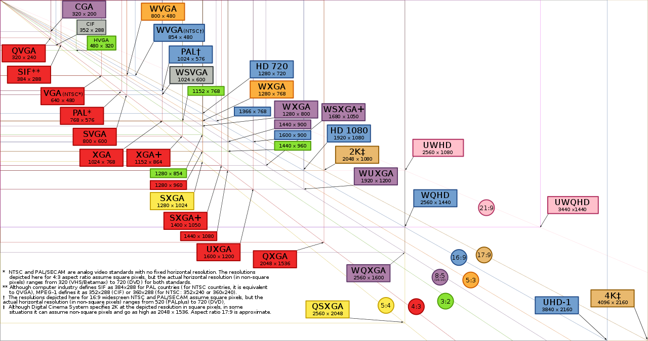
Wiki Article of Display Resolutions
PDF of the Wiki Display Resolutions
- Measurement units
- Absolute
- fixed in size regardless of the device rendering the web page
- Use when you know the physical properties of the device
- mm - millimeters
- cm - centimeters
- in - inches
- pt - points
- pc - picas
- 6 picas in an inch
- 72 points in an inch
- 12 points in a pica
- Conversion
- Relative
- Is scalable
- Use when you do not know the physical properties of the device
- Expressed relative to the size of other objects within the web page
- h1 {font-size: 2em;}
use twice the size of font size of the body - section h1 {font-size: 2em;}
Use twice the size of section font-size - Represents a single dot of the output device
- Most precise unit of measure
- Not scalable
- Resolution of most devices expressed in pixels
- Considered relative because the actual rendered size depends on the density of the output device
- Windows 96 dots per inch (dpi)
- Mac: 72 dpi
- Mobile: 200 or 300 dpi
- Relative sizes
- em - Meaning of em unit depends on size relative to the font size of the parent
- Pixel
- Larger/Smaller
- Sample text
- Sample text
- Sample text
- Sample text
My Windows10 display settings 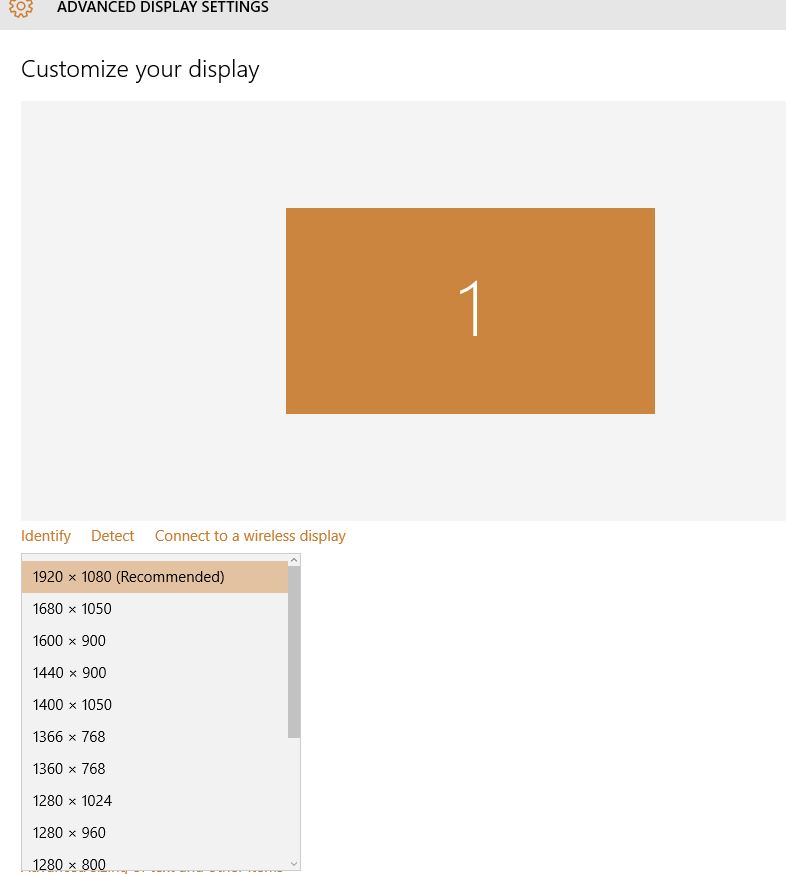
Width: 1920 pixels, Height: 1080 pixels, Size: 17.3 inches
Width: 15 inches, Height: 8.5 inches
physical DPI = horizontal pixels / horizontal inches, or
128 physical DPI = 1920 / 15
Total Pixels = 2,073,600 or 1.98 MP
Size comprisons of "Sample text"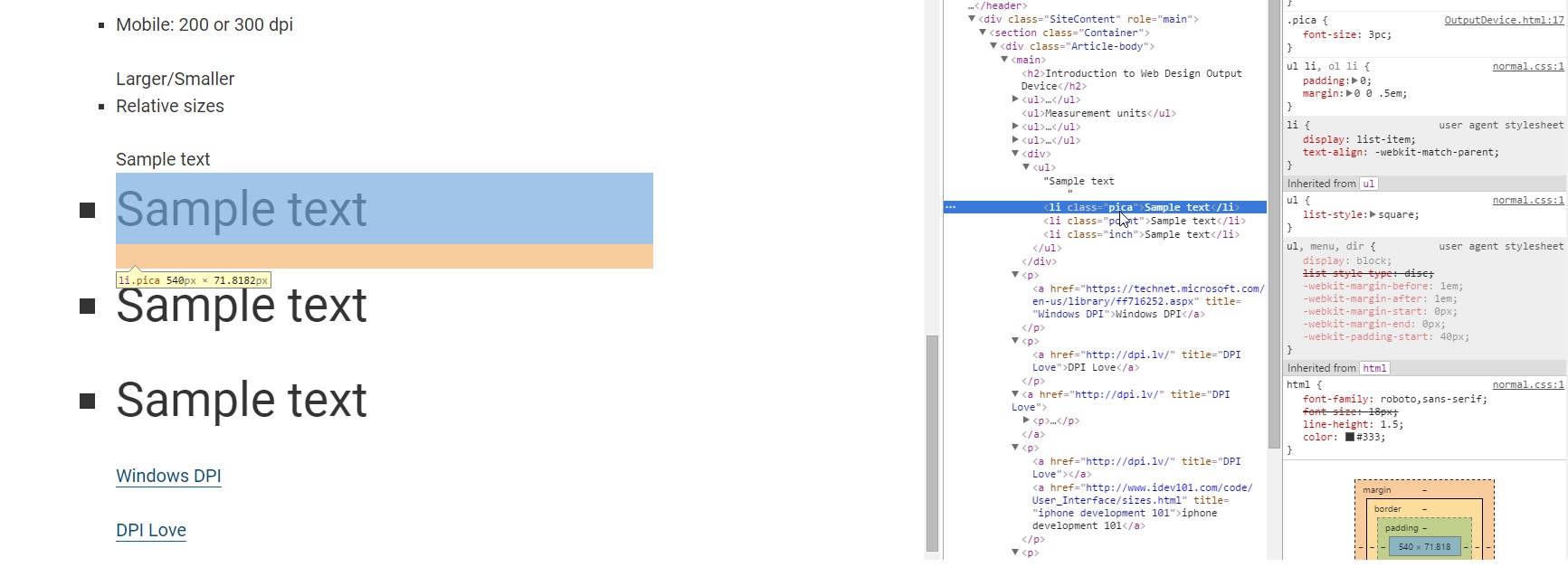
- width: 540px, height: 71.8182px
- font-size: 3pc;
- font-size: 36pt;
- font-size: 0.5in;
Specifics for iphone 5:
- Width x Height
- Height 568 pt, 7.8 in, 1136 px
- Width 320 pt, 4.4 in, 640 px
- Total pixels: 640 * 1136 or 727,040
- physical DPI = 640 / 4.4, or 145
Specifics for iphone 6:
- Width x Height
- Height 568 px
- Width 320 px
- Total pixels: 320 * 568 or 181,760 px
- physical DPI = /
Specifics for samsung tablet:
- Width x Height
- Height 1280 px
- Width 640 px
- Total pixels: 640 * 1280 or 819,200 px
- physical DPI = 640 / or 113
Specifics for samsung phone:
- Width x Height
- Height 960 px
- Width 640 px
- Total pixels: 640 * 1136 or 819,200 px
- physical DPI = 640 /
Media Queries for Standard Devices